Better technology, by design
Transforming the way digital services are built in government through human-centered design
Each month, over one million Michigan residents use the MI Bridges portal to access critical services like food assistance and healthcare.
Through the portal, they can apply, renew, and manage their benefits all in one place.
After partnering on the redesign of its paper benefits application, and seeing the impact, leaders in Michigan wanted to team up to bring human-centered design into the online benefits experience too. Since 2017, we’ve worked with the state and its technology vendor to redesign the portal in a way that would better serve its users —elevating residents’ concerns, wants, and needs to inform the process.
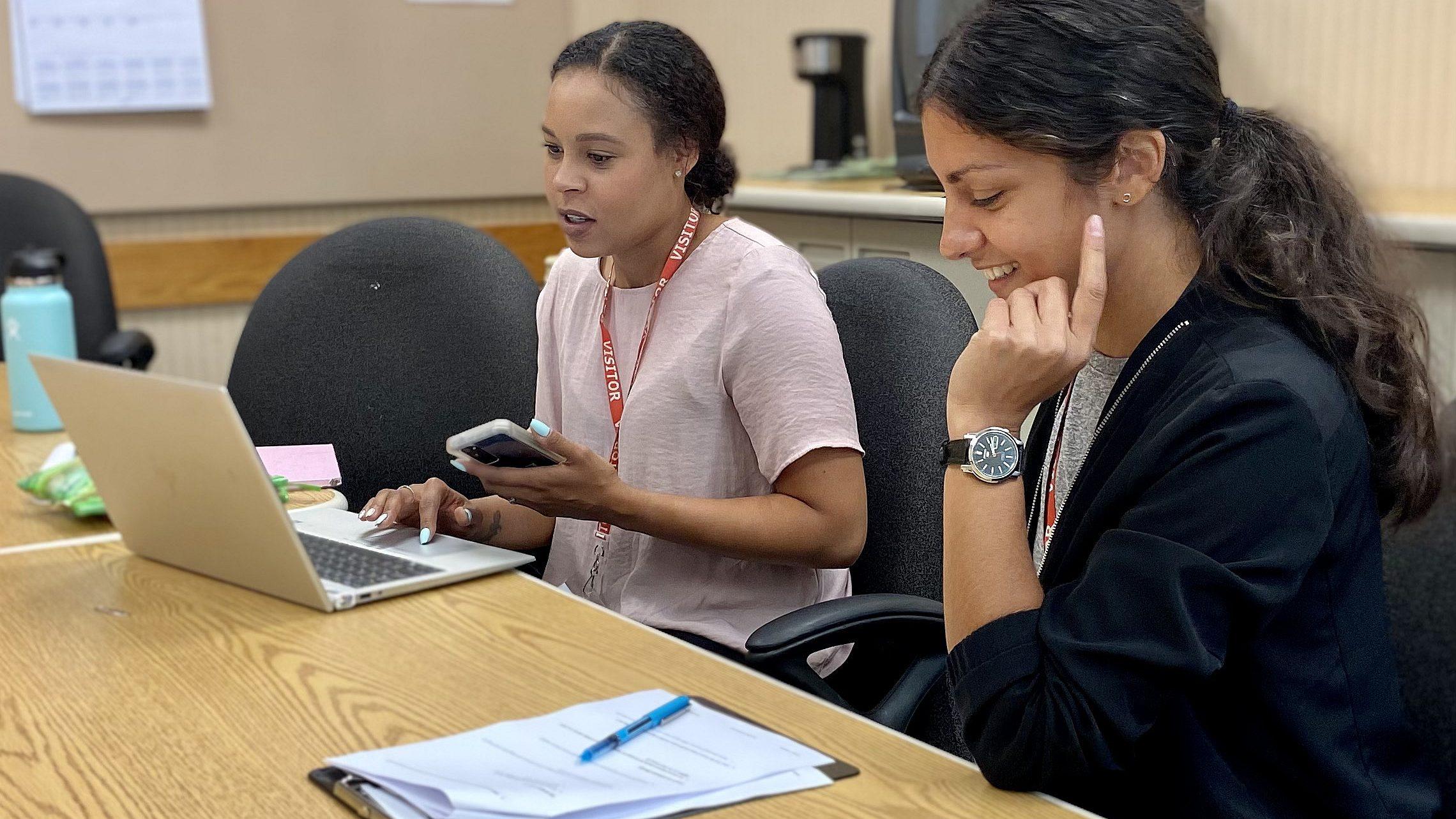
Bringing user voices into the fold hadn’t always been part of the process, though. When we started working on the redesign, a lot of the team’s time was spent in conference rooms. Designers, project managers, program specialists, policy experts, and technologists all huddled to make decisions about the best options for site navigation or about which functionality should be prioritized.
The most important voices – those of people who’d be using the website – were almost entirely absent. Soon after we began the redesign, it became clear that in order to make significant improvements for those users, we needed to work together to reevaluate Michigan’s software development process to allow user voices to be heard.
User voices to inform the design process
At Civilla, human-centered design is at the heart of our mission. To bring it to the forefront of our work on the MI Bridges website, we wanted to bring our partners at the State more closely into our process. We hosted a training and invited their team to learn some of the research methods that are central to our work - this included MDHHS leadership and their technology vendor. Soon after, they started joining us for user interviews, where we listened to residents’ stories, side by side, to ensure the new site was designed to meet their needs.
Over time, the State’s technology team has become even more integrated with our researchers - a process that’s shifted the culture of the team from one that was driven by personal opinions to one that is guided by user insights. Now, when we all huddle in a conference room we hear them lead conversations with “The user said…” instead of “I think…”.
Iterating to incorporate insights along the way
Traditionally, public institutions use a linear approach to build technology: they draft a proof of concept, articulate technical requirements, lock in the design specifications, and ship the whole thing to the engineering team to be built. Once the code was written and tested, the final product launches in one big bang. Unfortunately, feedback on the design often arrives too late to be incorporated, leaving end users (and the team) frustrated.
During the MI Bridges redesign, we worked with the State’s technology vendor to try out a new way of working. Rather than building the product linearly, we used much shorter, faster cycles.
We started by designing wireframes and mockups, light prototypes that demonstrated how the new technology would work, look, and feel. We brought each one into the field to test with residents and gain quick rounds of feedback so that the team could rapidly iterate on the designs before a single line of code was actually written.
The idea of validating (or invalidating) ideas based on users’ feedback caught on. More than 18 months later, this approach has enabled the technology team to incorporate hundreds of hours of feedback on each element of the software design.
When less is actually more
Technology conversations in institutions often focus on the promise of the new: new features, new pages, new functionality, and new tools. Like many organizations, state agencies secure funding and momentum by adopting new ideas to address old problems.
But new is not always better. Sometimes, the power of design lies in knowing where to simplify.
During the MI Bridges redesign, we worked with MDHHS and their technology vendor to determine what should be built and, more importantly, what shouldn’t be based on user feedback. For example, the team initially spent time brainstorming ways that the State could use text messages to communicate with applicants. We tested various ideas and heard consistently that residents only wanted to receive text messages from MDHHS that contained case-critical information. This feedback informed design decisions that would ultimately strengthen the communication channel overall.
With time, the technology team has developed a stronger point of view about how MI Bridges can maximize value for its users. In turn, the team is more equipped to identify opportunities to simplify, streamline, and delete.
Moving from quantitative to mixed-methods research
In institutions, quantitative data is often the dominant form of input for measuring user behavior. While quantitative data is very helpful in explaining what happened, it often requires qualitative data to explain why it happened.
Once the redesigned MI Bridges site launched, we worked with the State to pair quantitative data with qualitative insights to better understand where the site was falling short and how to improve it. Incorporating data from multiple sources helped us uncover insights that neither type of data could have on its own.
For instance, data showed that very few people were signing up for text message notifications on the new site. To understand why, we spent time with residents who were using MI Bridges – their stories helped us see that people were interested in receiving text notifications, but opting in was unintuitive and required users to click more than seven times.
After identifying the problem, the technology team moved the feature onto the dashboard so that clients could sign up with one click. Almost overnight, the number of people subscribing to text messages tripled. In this case and others, mixed-methods research provided the team with meaningful insights that continue to guide the improvement of the site.
Lasting learnings
In redesigning the MI Bridges portal, we started to see first-hand how human-centered design can be used to change the way government technology is built. Here are a few of our biggest takeaways which we hope to bring to future projects too.
Elevate user voices: Best practices are helpful, but they can only go so far. Listening to people’s pain points and enabling them to shape the design process ensures you’re actually solving real user needs. You’ll end up with a final product that users actually get value out of – instead of something you’ll need to redesign for the same reasons a year down the line.
Pair quantitative data with qualitative feedback: Neither will paint an accurate picture on its own. Mixed methods research can get you more reliable results. While making improvements, use quantitative data to identify a problem (Ex. “Only 12% of users are completing the form”) and qualitative to understand it more deeply from the user’s point of view (Ex. “It’s difficult for users to understand the language in step three, which may be why they’re dropping off.”)
Be iterative: Testing technology in iterative cycles allows teams to adapt quickly to feedback. You don’t have to wait for an entire redesign to be finalized to get it out in the world. Launching small pieces slowly over time can help you gain insights along the way, adjust if something isn’t performing as expected, and get a better experience out to users more quickly.
Less can be more: Knowing what to build and what to delete can save time and money. Let user testing inform what is and isn’t working, so instead of constantly adding projects or features to your task list – you can start removing the low-value ones too.
- Photo: Marisol Dorantes
related stories

closing the snap gap
New research on challenges young adults face and recommendations to fix them
read

A new tool for implementing Medicaid work requirements
Civilla's user-tested application templates can help states reduce paperwork and keep eligible residents covered
read

The Human Side of Medicaid Work Requirements
Four priorities for leaders to meet federal rules without losing sight of residents
read


