Making the Case for Change
The unlikely story of how Civilla came to partner with the Michigan Department of Health and Human Services

Before we started Civilla, one of our co-founders Mike spent 6 years carrying around a 40+ page scroll in his back pocket. No, it wasn’t a medieval artifact or a Shakepearan sonnet (though it was longer than Macbeth). It was the 1,000 question, 18,000 word application for public benefits in the state of Michigan.
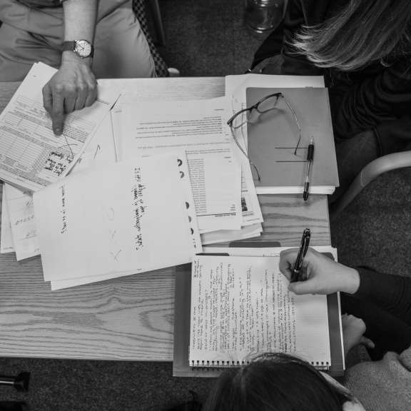
Formally known as the DHS-1171, the application was the longest of its kind in America at over 40 pages – a formidable barrier for over 2.5 million residents each year.
Mike had come across the application in his previous work with the United Way and had kept it in his back pocket, quite literally, ever since. It served as a daily reminder of how public institutions, originally designed to serve residents and communities, so often stray from that purpose. It also served as inspiration – pointing to the potential that human-centered design could unlock for these organizations.
From Mike’s back pocket to our first project
When we started Civilla, a fundamental piece of the vision that brought us together was our belief in public institutions. We believed (and still do) that institutions have an important role to play in scaling social change, and that human-centered design can help them bring about that change in a faster, more impactful way. Through human-centered design, institutional leaders can start to deeply understand the needs of the people they serve. They can get back to their original purpose, offering services meant to make people’s lives better, not more complicated.
Fueled by these beliefs, we started Civilla and set out to find our first project in 2016.
We were operating out of a storage closet in TechTown, about a mile from Downtown Detroit. So, when Mike pulled the DHS-1171 out of his back pocket one afternoon, you can imagine how it commanded the space...and our attention.
The benefits application was originally meant to serve the people of Michigan, but had lost sight of that intention along the way. Over the course of 30+ years, it had been designed around process and policy, lawsuits and audits–additions that had accumulated, without considering how they might actually impact people applying for benefits every year.
We knew right away that we’d found a project worth investing in. The application had the potential to illustrate the opportunity of human-centered design in institutions and make access to benefits easier for millions of residents each year.
Rooted in user research
Human-centered design is a process that aims to solve problems by deeply understanding the experiences of the people who are most affected by them. From there, we can build solutions that meet real needs. To kick off every project, we begin with user research to build an understanding of people’s experiences. The Michigan public benefits application was no exception.
We spent hours at kitchen tables and in living rooms, working to understand the public benefits through the eyes of those who interacted with the system every day. Residents shared their perspectives on problems with the system, and what they hoped it could look like instead. We heard that people felt lost. They didn’t know how to navigate the process, who to ask for help, or what came next. We heard people describe feeling like “a number in a mechanical system” rather than humans with complex stories to tell. We also heard about how daunting the application itself was – with confusing, repetitive questions geared more towards fraud prevention than helping folks get access to the services they needed.
After over six weeks of interviews, we’d learned a lot from residents. But we also learned we were missing a key part of the story: the frontline staff experience.
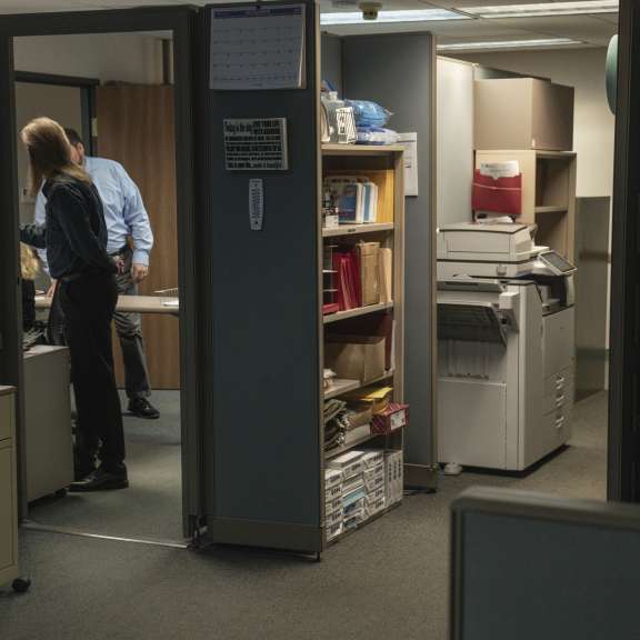
When residents struggled with the 40-page benefits application, they turned to the Michigan Department of Health and Human Services with visits, phone calls, and errored applications. Frontline staff at MDHHS were responsible for handling all of this. We knew that if we wanted to improve the experience we had to get their input too.
It was time to share our ideas with leaders at MDHHS and (hopefully) bring them on board.
Setting the right tone
We didn’t have any connections at MDHHS at the time, so when Mike cold-called their offices from his car one afternoon, it was a bit of a miracle that we got through.
On the call, Mike introduced our work and shared some highlights about what we’d learned from residents thus far. Careful not to sound overly prescriptive, he connected everything back to our user research with residents. He was also mindful not to make the call feel like an attack or accusation against MDHHS’s leaders.
At the end of the call, MDHHS leadership agreed to come into Civilla to hear us out.
“Welcome to the storage closet”
On the day of that first meeting, the elevator doors opened and two MDHHS leaders dressed in crisp suits and polished shoes stepped into our rugged storage closet. Mike unraveled the scroll, and we shared work-in-progress findings from our research with Michigan residents. One leader, Terry Beurer, said he’d been at MDHHS for 32 years and had never seen the DHS-1171 displayed that way – and man, was it overwhelming.
The meeting went well. Ultimately, MDHHS leadership agreed to connect us with frontline staff to continue our user research and come back in a few months to hear what we’d learned.
Bigger than a Powerpoint
Four months later, we’d spent hundreds of hours sitting alongside staff to understand how they processed applications, what their biggest needs were, and how they were impacted by the benefits application.
Now, we were ready to share our findings and our proposal with MDHHS leadership. And we knew a plain old Powerpoint just wouldn’t do the work justice.
Experiential learning is much more powerful than passive instruction so we decided our meeting would focus on interaction versus observation, people’s stories versus statistics – all with the goal of making the case for change.
The immersive experience
When the elevator doors opened this time, MDHHS leadership was greeted by a 5,000 square foot immersive experience we’d built to tell the story. We’d transformed our storage closet’s entryway into a Department of Health and Human Services reception room–recorded office noises humming in the background, and had “extras” in seats busily filling out the application.
“Welcome to the DHHS office at TechTown,” Mike, in character, greeted the group. “Please take a seat. You have 15 minutes to fill this out.”
We handed out copies of the benefits application to each leader without a clipboard or anything to write with – just like the offices we’d shadowed in research had done. Leaders struggled with curveball questions like “What is the date of conception of your child?” None of them completed it before the 15 minutes was up.
We chose this approach to kick off the meeting because being able to physically engage with the application in the same way residents did immediately built empathy around the problem in a way that a Powerpoint or fact sheet just wouldn’t have.
Next, we walked the leaders through a 100 foot long journey map, which we’d illustrated to depict what happens after an application is submitted. It helped bring to life the deeply complex experience for both residents and frontline staff and helped MDHHS leadership visualize the process more holistically, from the users’ eyes.
Finally, we shared a prototype of a simpler, shorter, clearer application to stretch their thinking on what was possible.
Committing to change
For MDHHS, the immersive experience was eye opening.
We learned during that meeting that, over the last 30 years, there had been five full efforts to redesign the application – each time they’d gotten stuck. We weren’t pointing out a new problem, but a new way to go about understanding and solving it.
Through the immersive experience, you could clearly see the end-to-end process and the inefficiencies for residents, caseworkers, and the department. Since everything was rooted in user research, it changed the conversation from “I think” to “Here’s what our users need.” It’s a lot harder to push back on real, lived experiences than it is on personal opinions. It’s also easier to commit to change when you can see how much is truly at stake.
Reframing the issue in this way helped us get buy-in from MDHHS to pilot the new application and redesign the experience together.
Lasting learnings
Our work on the Michigan public benefits application was just as eye-opening for us as it was for the folks at MDHHS. We learned a lot during those first few months – four main principles carry over into projects we take on today.
Assume good intent: During our early conversations with MDHHS, generous orthodoxy helped us build trust. Leaders frequently have people telling them about all the things they’re doing wrong. Chances are, these problems aren’t completely new to them. Rather than approach conversations with blame or accusation, we’ve found that giving folks the benefit of the doubt and recognizing the complexity of their jobs to be a lot more helpful in sparking partnerships and opening the door for constructive discourse.
Allow space for vulnerability: When we welcomed MDHHS for that first meeting, the unfinished storage closet was disarming. It gave them permission to let their guard down in a way that can be hard to do in formal meeting rooms and spaces. Socially, we tend to expect leaders to show up with certainty and polish. Sharing work-in-progress findings, rather than something fully baked, also helped encourage vulnerability by modeling it. We weren’t prescriptive and didn’t claim to have all the answers. Just a passion for solving the problem together.
Root everything in user research: Frame problems and solutions around the needs of the end user, not your own. Go out, talk to the people who are most impacted by your work, hear their stories, and listen for themes in what you’re hearing. When sharing the work, always bring your learnings and recommendations back to what you’ve heard from users.
Tell the story of your work in an engaging way: The physical act of walking someone through your work is powerful and engaging. And it doesn’t have to be a full immersive exhibit for every project. On a smaller scale, we often use a “no Powerpoint” rule in meetings – printing out slides and taping them up on the wall to walk through in-person. When we’re remote, we do our best to pair slides with some something interactive or physical that people can engage with – such as a video or a print out. Physical artifacts, like Mike’s scroll, help people think about problems differently and can bring challenges to life in a more palpable way.
This story is just the beginning. Our partnership with MDHHS has deepened over the years as we’ve worked together to take on more projects to help Michigan residents and caseworkers – like benefits renewals and the online user experience. With these principles in our back pocket (instead of Mike’s scroll) we’re able to build human-centered solutions, inspire leaders to action, and move hearts and minds to effect change in each new body of work we take on together.


